As the oldest B2B agency in the US, Omnicom-owned Doremus+Co has a century-long tradition of taking a non-traditional approach to B2B advertising.
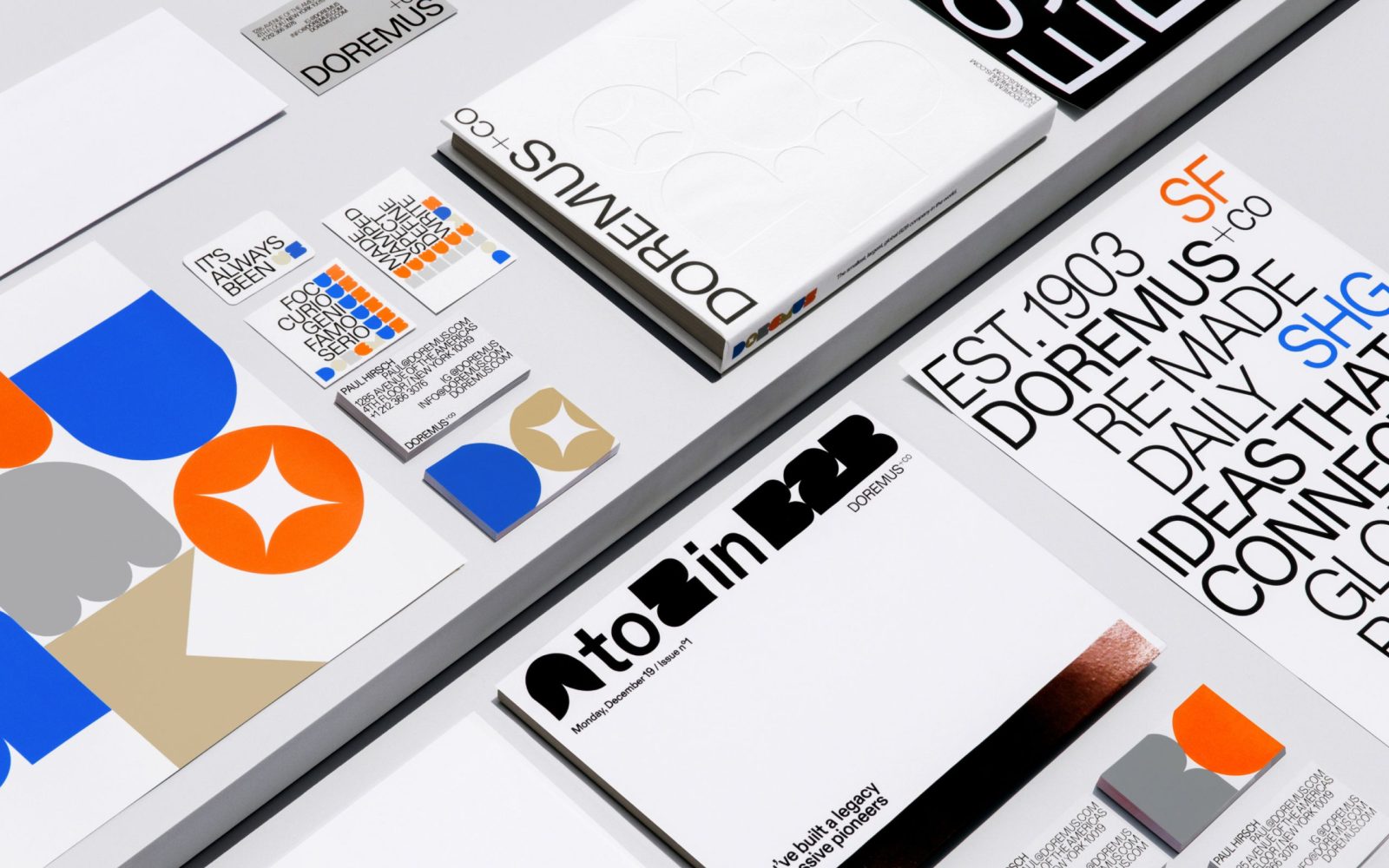
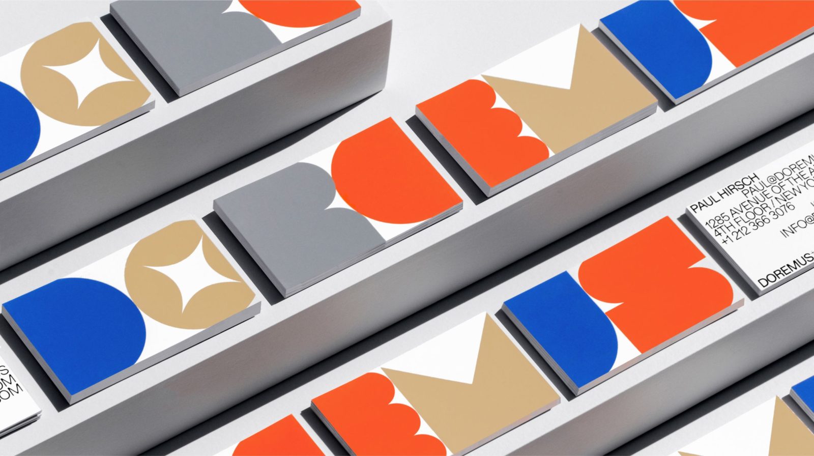
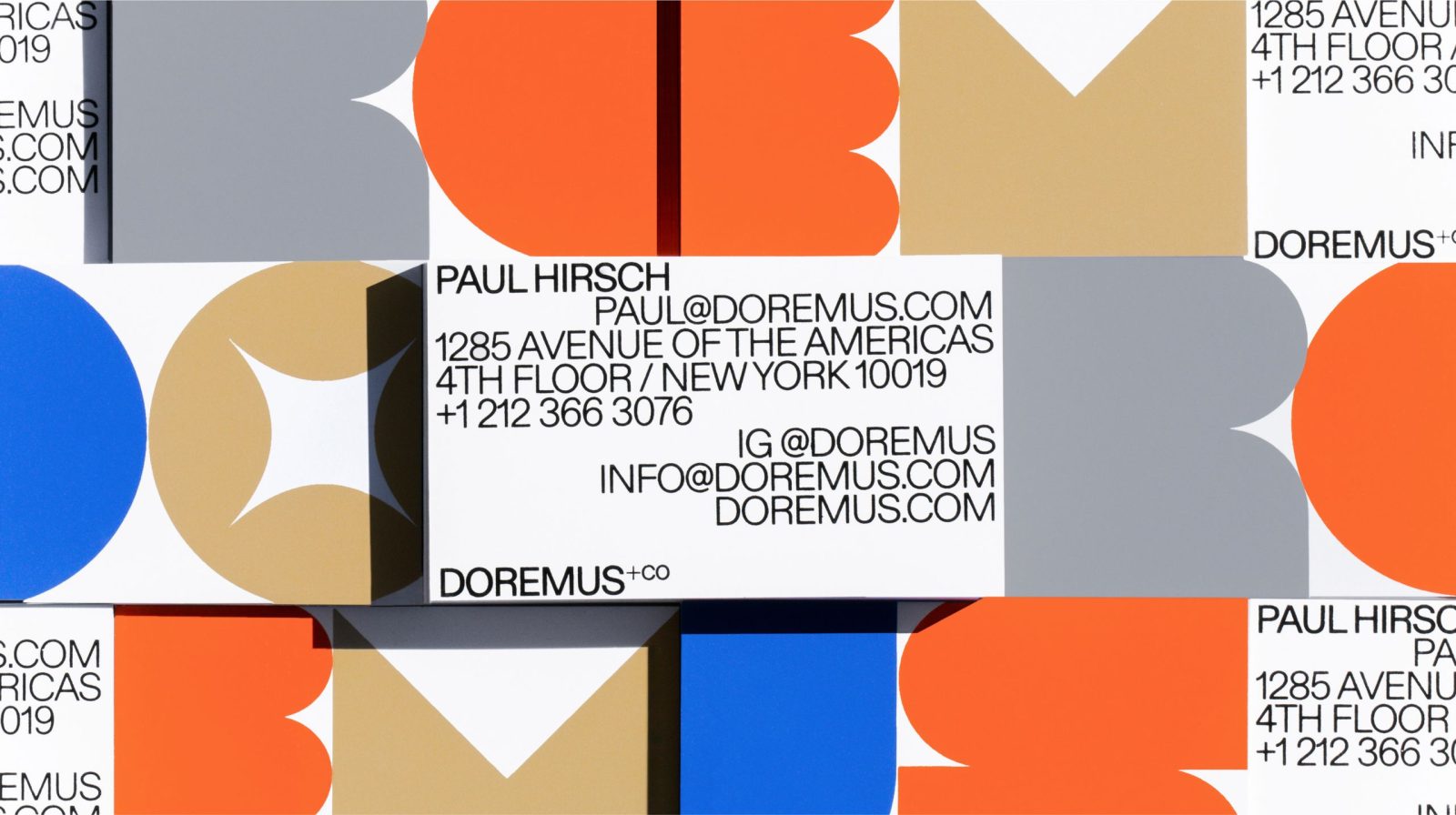
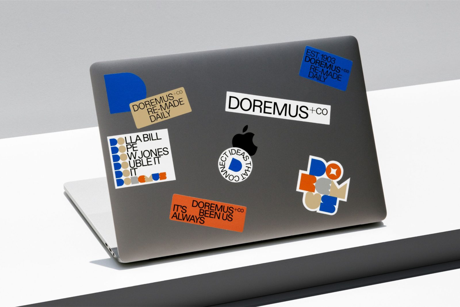
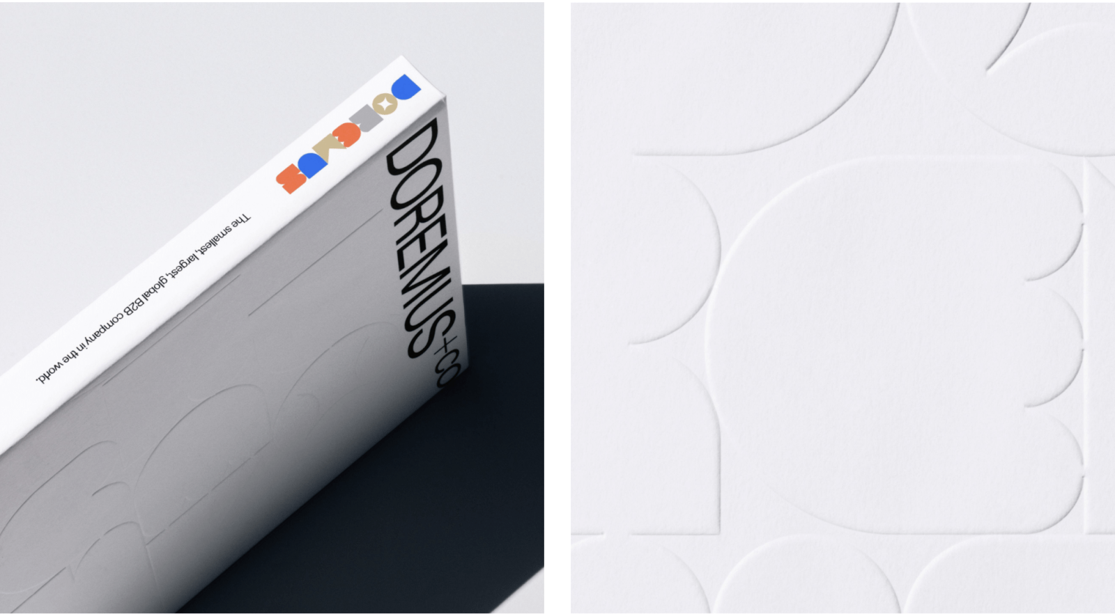
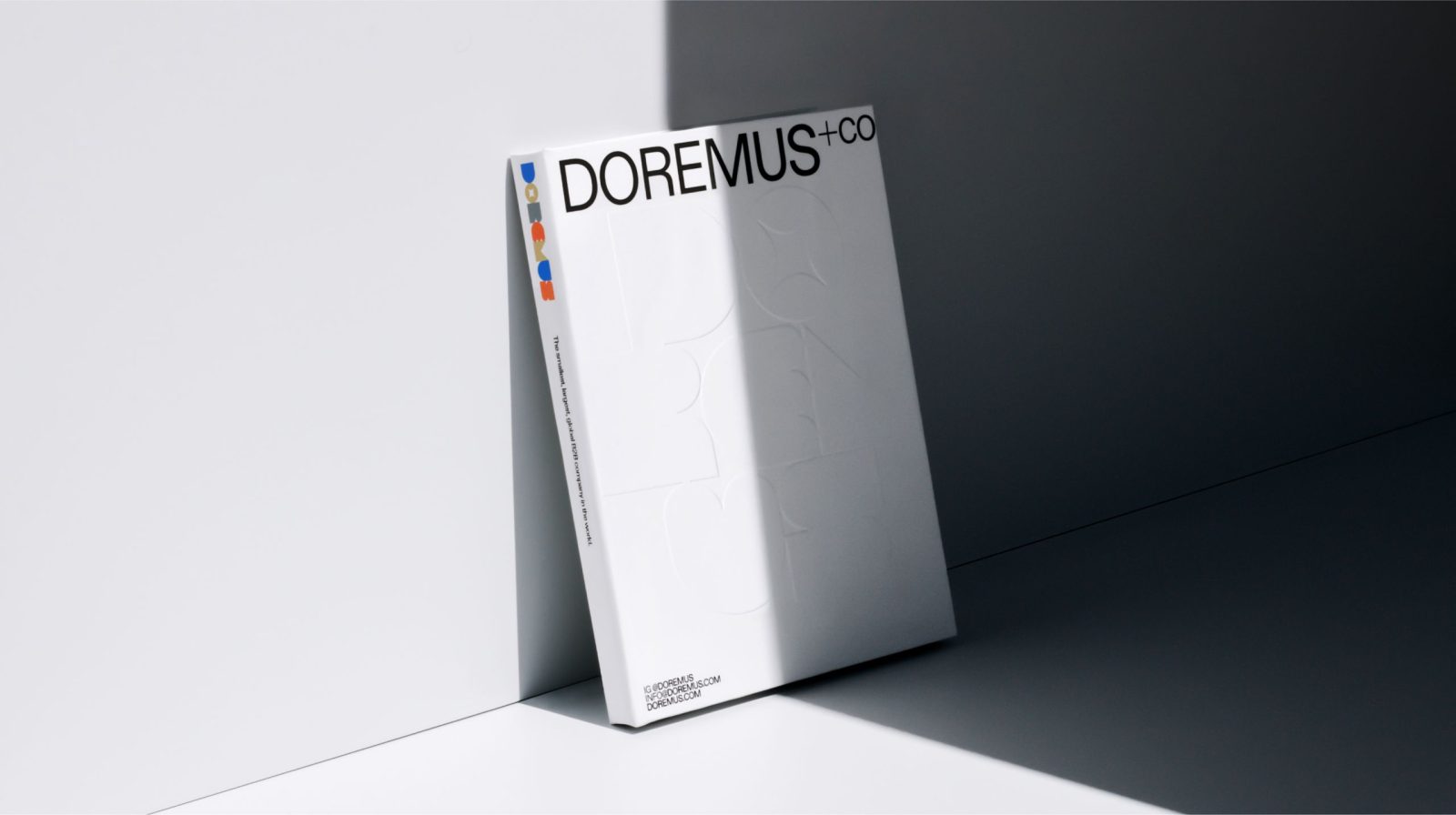
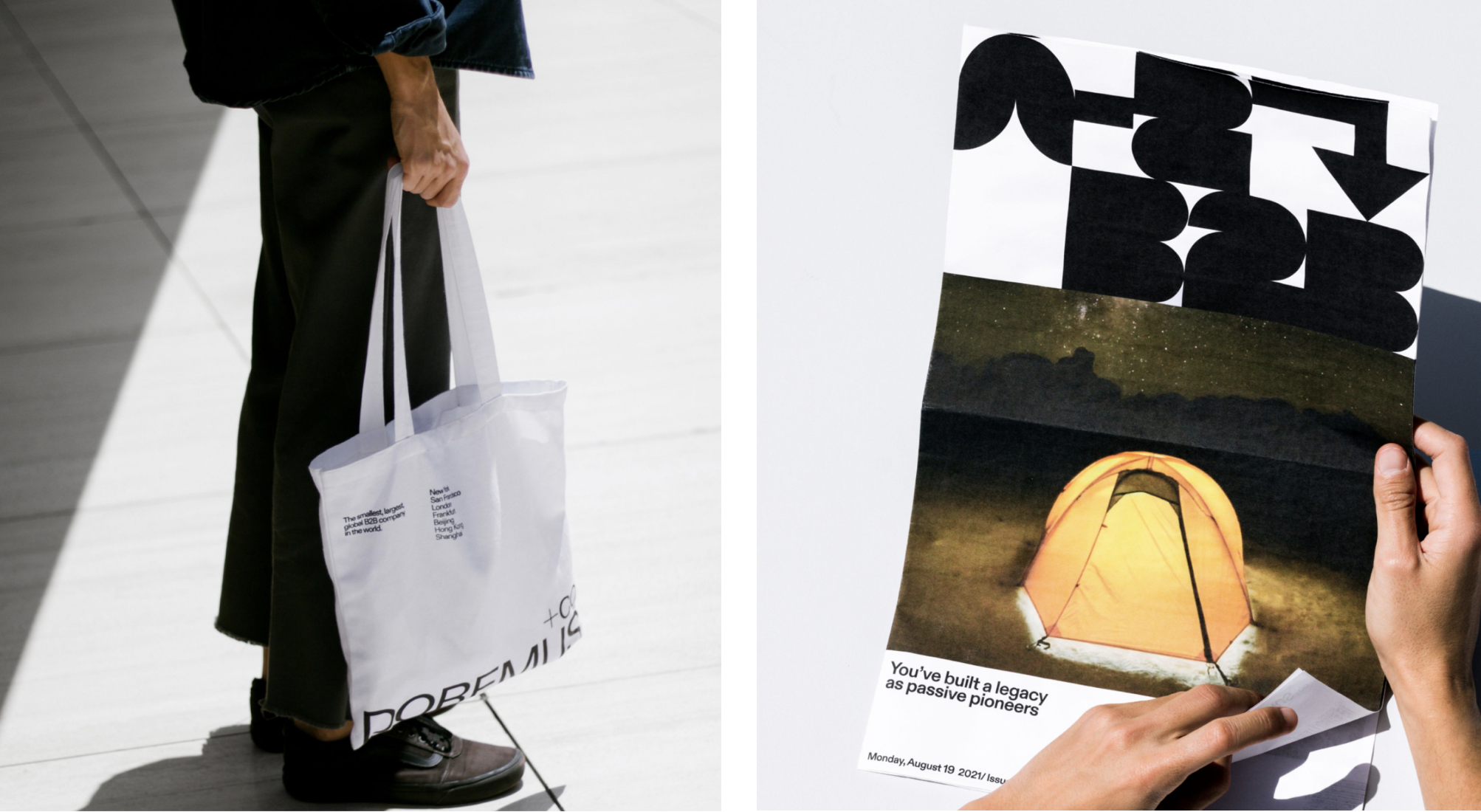
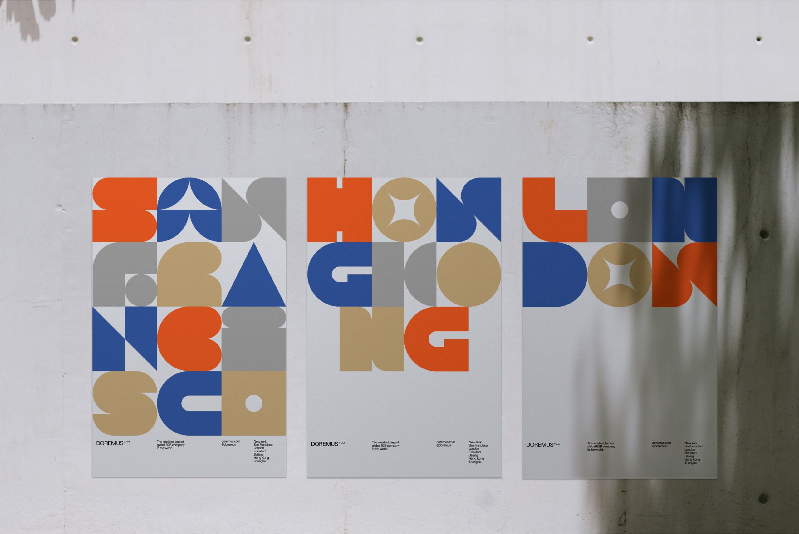
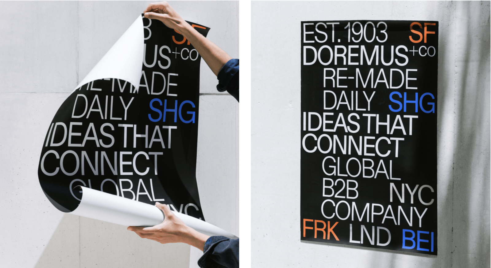
We created a visual identity system that honors their legacy while contemporizing it with a fittingly unexpected playfulness. At the heart of our system sits a friendly, colorful and shapely new type system we built called Doremus. These bulbous adventures in geometric abstraction (AKA letters) immediately communicate that this is not your father’s B2B agency. At least not anymore. When working in tandem with the more traditional yet still contemporary ABC Diatype font, the complete type system delivers a healthy balance of old world meets new that is undeniably original, intriguing and most importantly fun, a characteristic often not attributed to B2B advertising.
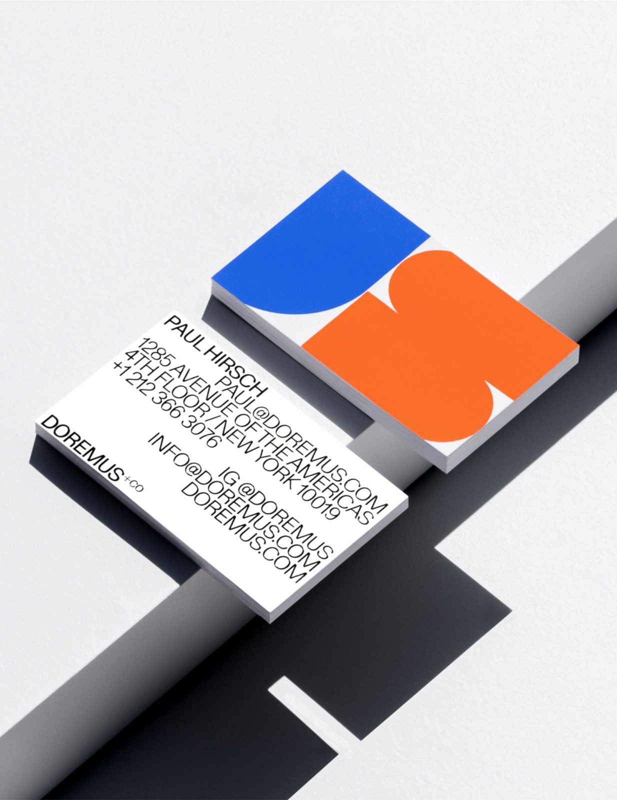
We chose a color palette of royal blue, salmon, camel and grey because it too plays into the central theme of plafyful and unexpected surprise. Seldom seen together (though why not when they look so handsome together), these colors evoke a confident yet almost carnivalesque feeling signaling that seriously interesting moments of amazement are about to unfold before your very eyes. So pay attention! (As if you could look away even if you wanted.)
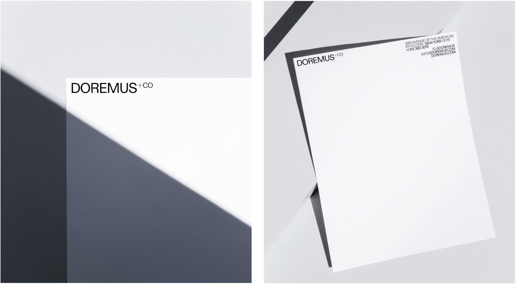
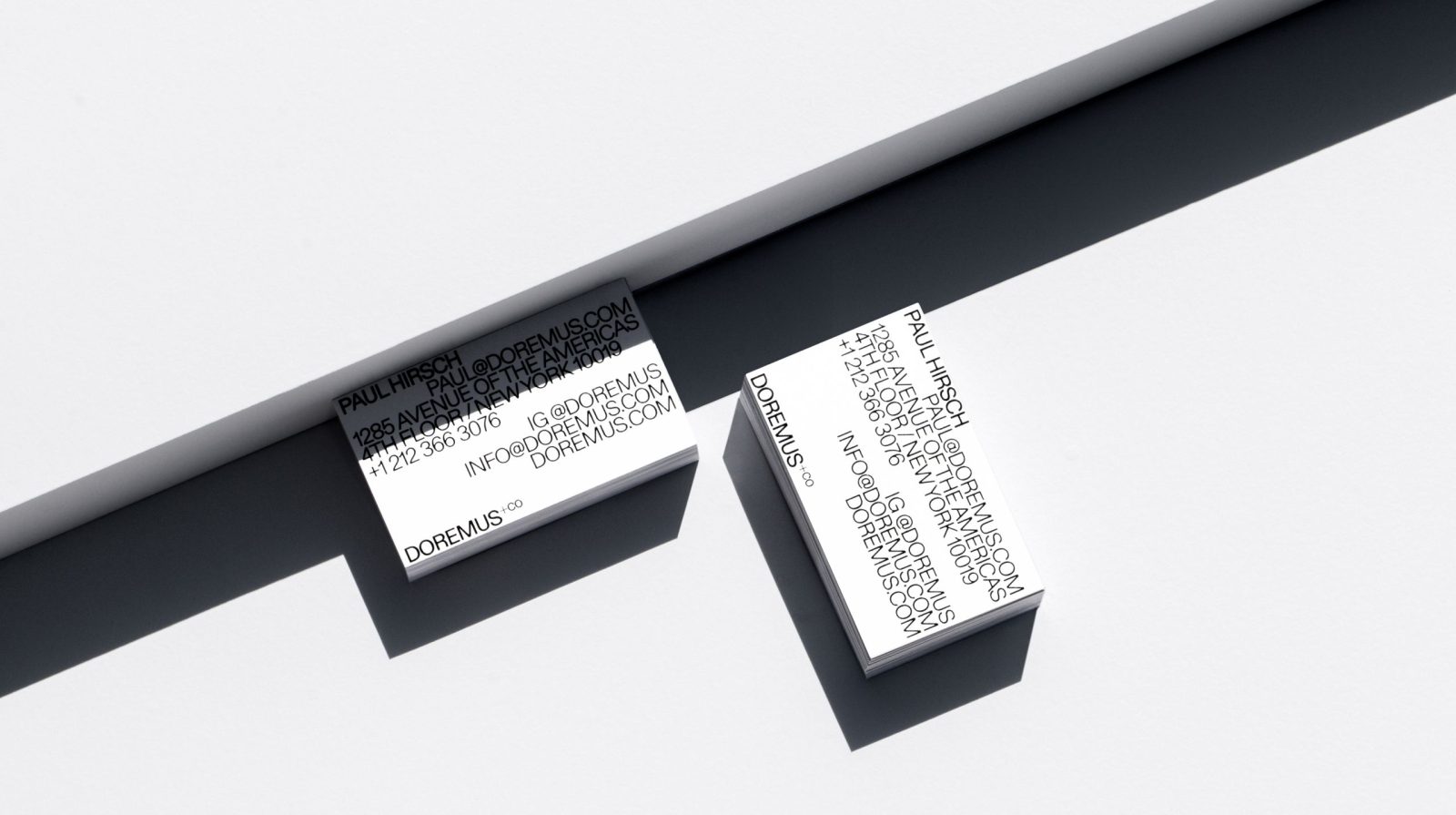
We implemented this new type system across the redesigned website, business cards and other collateral. Though biased, we firmly believe the world is all the better for it. Honestly we wish every piece of signage in the world aspired to the level of joy found in this work. Then again, perhaps if such glee was more widespread, this work would not ring out (or bellow even) with feelings that are oh so unforgettably special. So alas, we must all appreciate the new Doremus+Co brand identity where it lives. And live it does. Go ahead. Give three cheers for the updated Doremus+Co brand identity.
CREDIT
- Agency/Creative: Play Studio
- Article Title: Play Studio Created Doremus Brand Redesign
- Organisation/Entity: Agency
- Project Type: Identity
- Project Status: Published
- Agency/Creative Country: United States of America
- Agency/Creative City: San Francisco
- Industry: Mass Media
- Keywords: WBDS Agency Design Awards 2022/23
-
Credits:
Executive Creative Director: Casey Martin
Design Director: Nate Baltikas
Sr. Designer: Seth Lunsford
Sr. Designer: Rosie Manning
Designer: Albert Mestres
Designer: Chao Wang
Designer: Nic Claure
Designer: Ray Ramirez
Designer: Dylan Wells
Motion Designer: Lauren Konig


